
|
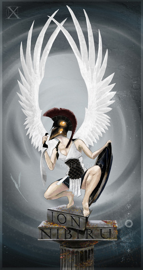
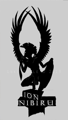
The ION NIBIRU Guardian
|

|
|
I completed the artwork for Sydney-based production house, Ion Nibiru, a company that offers creative projects in film and theatre. The title is drawn from an amalgam of ideas, ranging from Greek literature to Babylonian mythology. For their logo, they asked me to create something that reflected those qualities, so I set about roughing out ideas. Over the next few posts I’ll share a more coherent version of events that led to its completion.
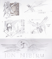
Concept Creation
|
|
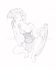
From these almost-thumbnails, Ion Nibiru picked the top right, a winged female Guardian in Greek hoplite panoply. She wasn’t based on any particular being from existing mythology, rather an amalgam of ideas. The Greek armour also hints culturally at the Ion reference in the name.
These sketches (left) are further developments on the thumbnail. The wings are modelled off photo reference of an osprey, a large coastal bird of prey. To develop it further, a couple of rough tonal studies were made, some with the horizontal composition and others with the front-on perspective, though Ion Nibiru began leaning towards the latter with wings stretched upwards in twin arcs as opposed to folded at the sides (below). |
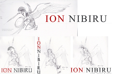
Pre-digital Pencils
|
After determining the general composition, the next stage was to produce pencil line art. When painting digitally in Photoshop, I prefer the painter approach by working to a scanned-in sketch. I drew the wings on a separate sheet of paper over the figure using a light box.
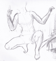
You can see in the original line art (right) her head would be tilted downwards, in a more reflective stance. At Ion Nibiru’s suggestion this was changed to have her gazing upwards, giving a sense of anticipation to her actions: what is she looking towards? Back in college I had a friend pose for a project with a similar theme, so that existing photo reference was mostly used to create the line art above. To get the particulars of lighting and posture, however I chose to do sketch from a model. The joy of housemates was having subjects on hand for impromptu life drawing sessions (primarily to make them suffer - the sketch material is an added perk). Thing is the Guardian’s pose is very transient (right); she may be in the act of landing or about to take flight. Holding this in-between posture, as my subject discovered, felt like missing the door to the chiropractor, falling down a flight of stairs and landing in the shadow of the face-planting AT-AT from The Empire Strikes Back. (Thanks Jade, hope the new spine works out for you). |
|
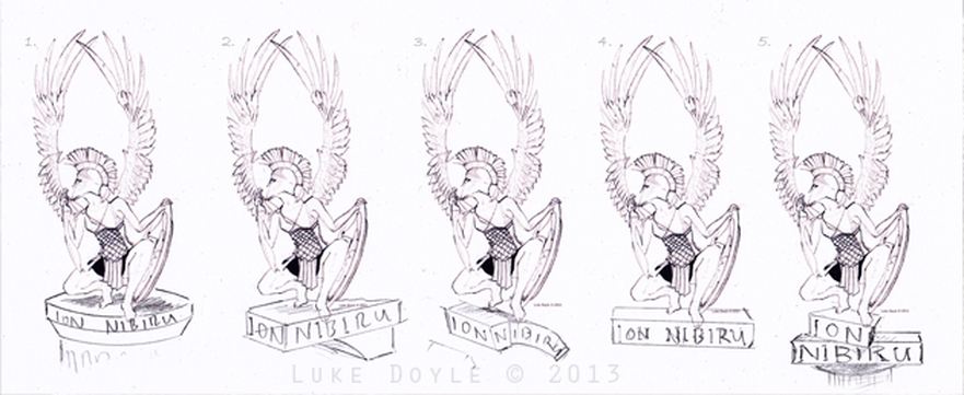
A later addition was to have the Guardian perched above a vine-entangled ruined column or pedestal, with the text ‘Ion Nibiru’ etched into the marble. I printed out the lineart as thumbnails and drew different versions of said columns, finally going with option #5 (below).
Digital Painting
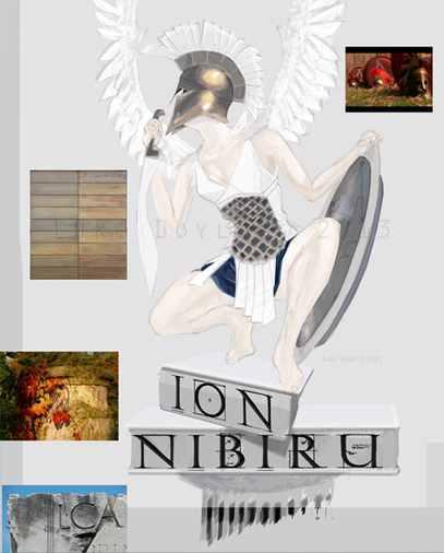
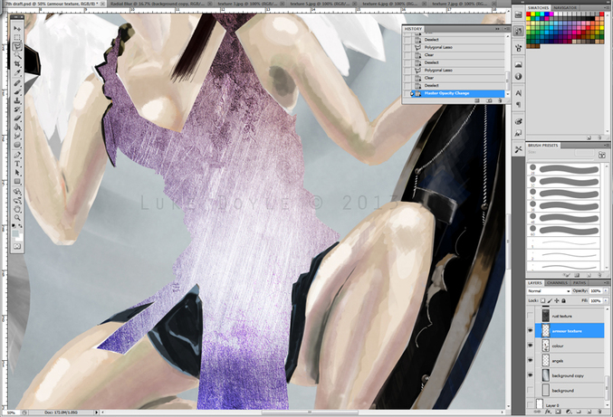
In Photoshop, I use the sketch as an overlay while I paint. I use an Intuos4 medium tablet, which now has a nausea-inducing swirly pattern from endless brush strokes (I’m considering sticking some book contact over the tablet’s active area so it doesn’t scratch so much, if it doesn’t affect the sensitivity).
Scattered around are images used as reference for colour, texture and lighting (left). At top right is a screenshot of Spartan helmets and armour from the Atlantic Productions Empires series, The Greeks: Crucible of Civilisation (go watch it, one’s life can only improve as a result), which served as reference for the Guardian’s helmet, the bronze scales embedded in the linothorax (body armour), the rim of the aspis (shield) and the hilt of the kopi (recurved sword - a well of delightful facts, am I).
In Photoshop I tend to use the standard round brush or a flat calligraphic, with opacity varying as I go – usually around 30, sometimes dropping to lighter tones for subtlety. The College I studied at didn’t teach digital painting, so what I know is drawn a lot from books, online blogs and workshops. One of the best sources available is Doug Chiang’s book, Mechanika: Creating the Art of Science Fiction with Doug Chiang.
|
Whilst in the painting stage I like to see how the overall form works in terms of shape, so I make a selection of it and create a silhouette. Here I can see whether the form is distinct enough on its own, without detail (right). As time went on the wings would be fleshed out more and more, so they would seem more convincing and functional.
Crest Colours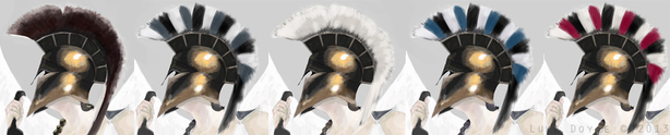
|
|
Above is a selection of crest colours that were trialled before settling on the crimson seen in the finished art. The crests seen on the helmets of Greek warriors were fashioned from horse manes, and fixed to the helmet cranial in any number of positions, the most commonly depicted being this sagittal type.
As far as colour is concerned, it is reasonable to assume the natural hair colour was used, so the range of colours was as wide as there were horse breeds available. To generalise, black, grey, white, and a range of more earthen colours from bays, chestnuts, and others would represent the palette.
Unlike other cultures, such as medieval European with its formalised system of heraldry, there is no clear evidence for the design of ancient Greek warrior crests serving any particular display purpose. One is free to conceptualise; given the value of the individual as tied to the community in Greek culture, that the crests, along with the detailed livery emblazoned on their shields, was to signify the hoplite’s family and connection to a city-state.
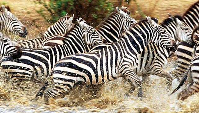
Another use would be more tactical. When facing down hoplites in phalanx formation, the enemy would see an array of vividly coloured and patterned crests, bristling in the wind and to every measured stomp of the encroaching enemy. The effect would have been dazzling and unnerving, in the way a herd of zebra herd can throw off a predator’s focus by the mass of stripes hindering them from targeting a single animal (right).
Photo credit: ABC News (Not the Australian one).
Photo credit: ABC News (Not the Australian one).
Textures
To infuse a little detail into broader areas like the wings, armour, etc., I turned to some photo reference of rust, stone and brushed metal – anything which had an interesting texture and with good contrast of dark and light areas (left). I brought these into Photoshop as a separate layer above the subject area, then played with the layer attributes – soft layer, luminosity, overlay, etc. The layer would then be trimmed to match whatever area was being textured.


|
(above) You can see the underlying paintwork (well, pixelwork) at left, and at right with the texture overlaid in ‘Darken’ mode.
|
The fine-grained texture on the eroded limestone column (if memory serves) is from a sheet of thick-toothed paper (above). The texture over the starscape is from a photo I took of a decommissioned WWII submarine with frayed fibreglass patching.
|
Permissions
All artwork and text © Luke Doyle/Loukash, 2013 and/or their respective owners as stated. For any commercial uses of content in this blog, please contact me first via email; loukas.ash@gmail.com
For more of my work visit: http://loukash.wordpress.com/
For more of my work visit: http://loukash.wordpress.com/
